A Beginner’s Guide to Statistics in Python
In the world of data science, statistics is an essential tool for making sense of data. It helps us understand patterns, relationships, and trends in data sets. Python is a popular language for data science, and in this tutorial, we will explore how to use Python for statistical analysis.
Data Set
Before we start analyzing data, we need to understand what a data set is. In the mind of a computer, a data set is any collection of data. It can be anything from an array to a complete database.
Data Types
To analyze data, it is important to know what type of data we are dealing with. There are three main categories of data types: numerical, categorical, and ordinal.
Numerical data are numbers, and can be split into two categories:
- Discrete data: numbers that are limited to integers. Example: The number of cars passing by.
- Continuous data: numbers that are of infinite value. Example: The price of an item, or the size of an item.
Categorical data are values that cannot be measured up against each other. Example: a color value, or any yes/no values.
Ordinal data are like categorical data, but can be measured up against each other. Example: school grades where A is better than B and so on.
By knowing the data type of your data source, you will be able to know what technique to use when analyzing it.
Mean, Median, and Mode
In statistics, there are often three values that interest us: mean, median, and mode. Mean, mode, and median are different ways of finding the average or central value of a set of numbers. They are also called measures of central tendency.
Different situations may require different measures of central tendency. For example, mean is often used when the data is symmetric and does not have outliers. Median is often used when the data is skewed or has outliers. Mode is often used when the data is categorical or discrete.
Let’s look at an example in Python. We have recorded the speed of 13 cars:
speed = [99, 86, 87, 88, 111, 86, 103, 87, 94, 78, 77, 85, 86]
Mean
The mean value is the average value. To calculate the mean, find the sum of all values, and divide the sum by the number of values:
mean = sum(speed) / len(speed)
print(mean)
Output: 89.77
We can also use the NumPy module to calculate the mean:
import numpy as np

mean = np.mean(speed)
print(mean)
Median
The median value is the value in the middle, after you have sorted all the values. It is important that the numbers are sorted before you can find the median.
speed.sort()
median = speed[len(speed) // 2]
print(median)
Output: 87
We can also use the NumPy module to calculate the median:
import numpy as np

median = np.median(speed)
print(median)
Mode
The mode value is the value that appears the most number of times.
from scipy import stats

mode = stats.mode(speed)
print(mode)
Output: ModeResult(mode=array([86]), count=array([3]))
Standard Deviation and Variance
Standard deviation is a number that describes how spread out the values are. A low standard deviation means that most of the numbers are close to the mean (average) value. A high standard deviation means that the values are spread out over a wider range.
Variance is another number that indicates how spread out the values are. In fact, if you take the square root of the variance, you get the standard deviation! Or the other way around, if you multiply the standard deviation by itself, you get the variance!
Let’s look at an example in Python. We have recorded the speed of 7 cars:
speed = [86, 87, 88, 86, 87, 85, 86]
import numpy as np

# Standard deviation
std = np.std(speed)
print(std)

# Variance
var = np.var(speed)
print(var)
Output:
0.9035079029052513
0.8154761904761907
Data Exploration
Data exploration is the first step in data analysis that involves using data visualization tools and statistical techniques to uncover the characteristics and patterns of a data set. Data exploration helps to understand the data and make predictions about it.
Data distribution is a function that describes the relationship between the values or intervals of a data set and their frequencies or probabilities. Data distribution can be discrete or continuous, depending on whether the values are finite or infinite. Data distribution can have different shapes, such as symmetric, skewed, uniform, bimodal, etc. Data distribution can also be described by measures of central tendency (mean, median, mode) and measures of variability (range, standard deviation, variance).
Histogram plots and scatter plots are two types of data visualization tools that can be used for data exploration. Histogram plots show the frequency or density of values in a data set by using bars of different heights. Scatter plots show the relationship between two variables by using dots to represent pairs of values.
Data exploration can be done using different methods, such as manual inspection, trial and error, scripting and querying, or machine learning algorithms. The choice of method depends on the size, complexity, and purpose of the data analysis. Data exploration can also require data cleansing, data transformation, and data integration to improve the quality and usability of the data.
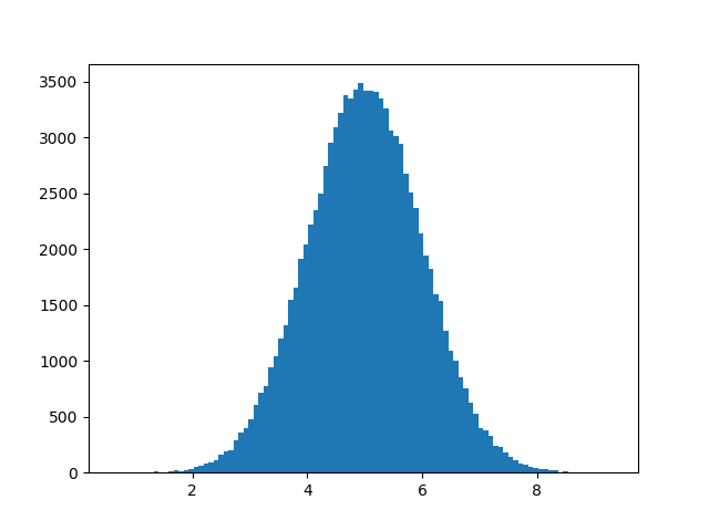
Normal Data Distribution
In probability theory, normal data distribution is also known as the Gaussian data distribution, after the mathematician Carl Friedrich Gauss who came up with the formula for this data distribution. A normal distribution graph is also known as the bell curve because of its characteristic shape of a bell.
Let’s create an array with 100000 values that are concentrated around a given value and draw a histogram with 100 bars:
import numpy as np
import matplotlib.pyplot as plt

x = np.random.normal(5.0, 1.0, 100000)
plt.hist(x, 100)
plt.show()
Output:
Scatter Plot
A scatter plot is a diagram where each value in the data set is represented by a dot.
x = [5, 7, 8, 7, 2, 17, 2, 9, 4, 11, 12, 9, 6]
y = [99, 86, 87, 88, 111, 86, 103, 87, 94, 78, 77, 85, 86]

plt.scatter(x, y)
plt.show()
Output:

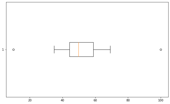
Box Plot
A box plot is a graphical representation of the five-number summary of a data set. The five-number summary consists of the minimum, the maximum, the median, the first quartile and the third quartile of the data set.
A box plot is drawn by using a box to show the range from the first quartile to the third quartile, with a vertical line inside the box to indicate the median. The box is then extended by two whiskers that show the minimum and maximum values of the data set. Sometimes, outliers are also plotted as individual points beyond the whiskers.
A box plot is used to summarize and compare the distribution and variability of different data sets. A box plot can show the center, spread, symmetry and skewness of a data set. A box plot can also show potential outliers or gaps in a data set.
An example of a random data set and its box plot is shown below:
import pandas as pd
import numpy as np
import matplotlib.pyplot as plt

fig, ax = plt.subplots(figsize=(10, 6))

# Generate a Series with 30 random numbers with mean 50 and standard deviation 10
data = pd.Series(np.random.normal(50, 10, 30))

# Add some outliers to the Series
data[0] = 10
data[1] = 100

# Create a horizontal box plot of the data
ax.boxplot(data, vert=False)

plt.show()
Conclusion
In this tutorial, we have learned about statistics in Python. We explored different measures of central tendency such as mean, median, and mode, and measures of variability such as standard deviation and variance. We also learned about data exploration using data visualization tools and statistical techniques. Python provides a vast array of tools to perform statistical analysis and data exploration, and we hope this tutorial has given you a solid foundation to start exploring and analyzing data.